
How to Choose Expressive, Fun & Long-Lasting Paint Colors for Interior Design?

When it comes to the interior design of your home, the color of the paint is the final touch. With painting, the design of your home ends. As it is the finishing part for you, it is the other way round for your guests and friends. Imagine if a colleague comes over to your home, what is the first he is going to notice or see? Of course, the paint. And you must have heard the old adage that goes, “first impression is the last impression.”

Max / Pexels / Paint is the most important part of interior design as it is the first thing that beholders look at.
So, if the paint is bright and attractive, they will most likely develop a positive impression. And what could be a better feeling than receiving a genuine and wholesome compliment from your friend on something that you have pondered over? With this in mind, we have talked to interior designers and have tried to figure out all the ins and outs of painting. Like, as what tools to use, what color works best, and what is the best finisher color, etc?
Although there are no hard and fast rules for painting, you can go out of your way to take the painting to a whole new level. Nonetheless, you must have some familiarity with the basic know-how of it. Here is what those professional designers came up with:
-
Hues are Essential; Choose Creatively
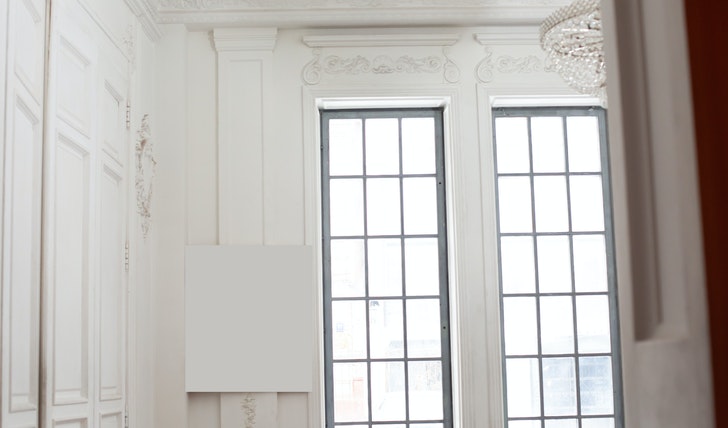
Monstera / Pexels / All-white color is the most attractive and widely used paint throughout the world. Argue interior designers.
Most of the designers, that we talked to, were of the opinion that the colors – AKA hues – are essential. And one has to be creative while choosing them. “Generally, bright colors like white, blood-red, and black are the most attractive ones,” suggests one of the designers that we talked to. She went on to say that taking the hues to every part of your house’s interior is another way of introducing creativity with painting. “Take it to the walls, ceilings, cupboards, and to the entire roo,” she asserts.
Nevertheless, what is most important is that the color you are looking to paint should be something you feel good every time you look at. Since you will be the one looking at the paint more than anyone, you should feel good about it first. Then, you can look for options outside you.
-
Say No to Heterogeneity
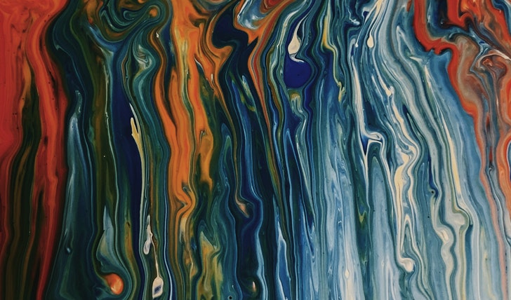
Dids / Pexels / A paint with a mixture of colors deviates focus and looks bad at the first glance, per interior designers.
This apparently sounded an unpopular opinion when I heard one of the designers saying it. “I don’t like the mixture of hues that most people make. Heterogeneity of colors is not a good idea,” he argued. When asked, he said: “Well, there are multiple reasons for that.
To begin with, a mixture of paints deviates your focus. You just can’t stay focused if you are looking at a wall that has black, green, red, yellow, and white colors all in one.” He went on to say, a mixture of colors does not look good to the eyes at the first glance.
Nonetheless, this is by no means a fixed rule of painting. If you think otherwise, you can do that too. But just consider the pros and cons. And if you still feel the yearning for doing it, you are good to go for it.
More in Leisure
-
`
Here’s Everything You Need to Know About Open Relationships
An open relationship is a consensual arrangement where partners agree to engage in romantic or sexual relationships with other people. Unlike...
June 6, 2024 -
`
Explore the Multifaceted Goals of Meditation
What is the goal of meditation? If you have ever found yourself asking this question, you are not alone. Meditation has...
May 31, 2024 -
`
When is National I Love You Day Celebrated? Mark Your Calendar
Life can get hectic, and sometimes amidst the daily grind, we forget to express our love and appreciation for the phenomenal...
May 23, 2024 -
`
When’s the Best Time of Day to Fish?
For any angler, a successful fishing trip hinges on several factors. But one of the most crucial elements is timing. Knowing...
May 14, 2024 -
`
What Mental Illness Does Britney Spears Have? Discovering the Answer
Britney Spears, a name that resonates with millions around the globe, goes far beyond the glitz and glamour of her stardom....
May 7, 2024 -
`
Here Are Some Easy Ways To Say No To Unrealistic Expectations In Your Relationship
If you are in a relationship, you should constantly work on improving it. Some early lovebirds fall in love too quickly...
May 3, 2024 -
`
Therapy? Medication? What Are the Treatments for PTSD
Post-Traumatic Stress Disorder (PTSD) is a common after-effect of traumatic events. It can be a debilitating condition, but the good news...
April 25, 2024 -
`
Courting vs Dating – Which Relationship Path is Right for You?
In today’s fast-paced world, the terms ‘courting’ and ‘dating’ often swirl around in conversations about relationships. While some people may use...
April 23, 2024 -
`
Essential Mexico Travel Tips for a Seamless Adventure
Mexico, a land of vibrant culture, breathtaking landscapes, and mouthwatering cuisine, beckons travelers from across the globe. But before you embark...
April 16, 2024











You must be logged in to post a comment Login